 Gallery
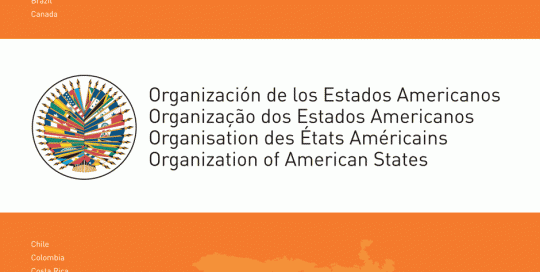
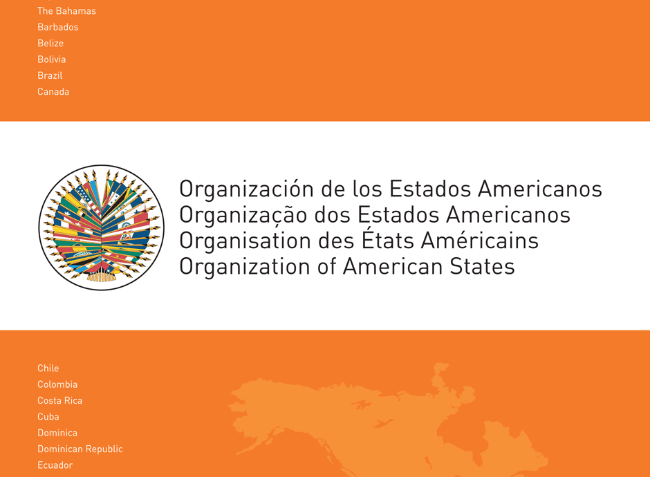
We were chosen by the Organization of American States, an organization which serves as a political, social and economic forum for its member states from all over the Americas, and were given the task of redesigning their logo. The creative process for us focused on the Identity Scale, in order to stay true to the professional tone of the organization’s services. We redesigned the logo, in both English and Spanish and detailed new specifications, colors, and typography to be adopted by the organization in its stationery and official documents.
QueGangas Branding
Branding, Brochures, Logos, Print
In most projects, the audience is the key factor determining the approach and theme to branding. At 1127 Graphic Design, we call that the Appeal Scale. This is truly the case with QueGangas, a website targeting a Colombian audience and designed to promote the goods and services of others through the use of discount coupons.
 Gallery
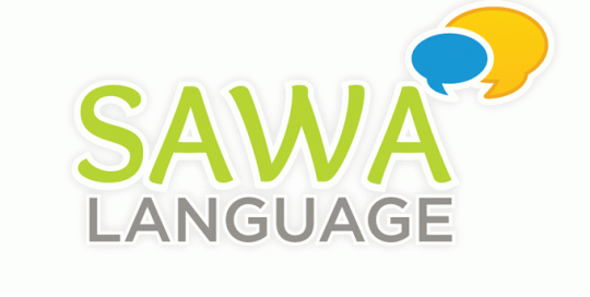
SAWA Language Branding
Branding, Brochures, Logos
SAWA Language is a growing company that offers students programs to learn Arabic Language in USA. SAWA Language approached 1127 Graphic Design to create the branding of the company. We developed a new logo design, the stationary, the brochure and the web site.
Prada Gallery Stationary
Branding, Logos
An artist approached Imaginelo with a project to create an entire brand identity for a new art gallery. The web design showcases and highlights the art by using a grey and black toned-down background where the colors and abstract shapes in the paintings can act as the attention-getting material on an otherwise flat and lifeless computer screen. The focus of the website is the visual, so Imaginelo’s web and logo design was centered on clean, sharp lines and a modern display and arrangement of images so as to not compete with the artist’s creative works.
A.J. Colón
Branding, Logos
This project showcases the idea that teamwork between Imaginelo’s creative team and the client is critical in the creative process. The evolution of the logo for this consulting firm focusing on education and business management takes both the client and Imaginelo’s team on a creative journey exploring various designs, from the abstract to the literal, until we landed on the most effective logo. The client’s choice is a logo inspired in the concept of a pencil, likely the most basic of the symbols representative of education. Imaginelo’s focus here was on the Identity scale, matching up the character of the client’s business with an effective logo.
Postcards4Realtors
Branding, HTML Websites, Logos
A marketing services company requires an approach where both its logo and its own work product of marketing materials are highlighted in its branding concept. With postcards at the center of its business, Imaginelo’s approach to this real estate advertising business logo concentrates on the company’s web address displayed in connection with a geometric design of rectangles and squares in various sizes and placements simulating postcards. The website design is image-heavy and focuses on an easy to navigate menu of the client’s sample products for quick access to a variety of the client’s services.
Duzo & Mille Gallery
Branding, Logos
This project consists of a talented artist seeking to conceive a brand identity for its gallery, namely, logo conception and business card design. The client’s instructions are an important guide in this creative exercise since its predominantly Latin American art, rooted in striking color, serves as the inspiration for the branding. Imaginelo targets both eye-catching color and bold lines in this project, and follows a restrained approach in order to bring to life a classic and balanced look in the logo. The business card design juxtaposes the conservative logo with the artist’s flamboyant use of color in its works.